BusinessStages of UX Process Explained

Stanislav Naborshchikov
Solutions Specialist
Table of contents
- Introduction
- 1. A workshop with a client (2-3 days)
- 2. Backlog
- 3. Navigation Concept / Navigation Concept
- 4. Wireframing / Prototype
- 5. Clickable prototype
- 6. Visual Design
- 7. Interaction Animations
- Conclusion
- Exploring UX, UI, and Graphic Design at Mobile Reality
Share the article
Introduction
A good mobile app is not only about its useful functions and the income it brings. How often have you deleted the program you seem to need from your smartphone because you got tired of “poking around” in its interface to complete your task? To prevent this from happening to your work, you need to carefully analyze the user experience (often abbreviated as UX – User Experience) and transform it into a competent interface.
In this article we describe in detail how this process looks in Mobile Reality, also we will share our approach to UX design and tell you for what purposes we use it, what stages this process includes, and what customers get as a result.
If you’re thinking about a digital product for your company and would like to save time - check out our end-to-end software development services page as we offer full-stack mobile & web product development.
1. A workshop with a client (2-3 days)
A workshop is a brainstorming session with a client, during which you find out the essence of the product, its industry, competitors, who the main user is, and their pain points (problems), as well as the main tasks of the product.
Creating Persona / Creating "persons"
This is the first and main stage in the UX process. Identify at least 2-3 people, specify their gender, age, and where they work. What problems does he have related to the subject of your client's product? At what time of the day does the user access the site/use applications? Etc. After you have answers to all kinds of questions, give the characters' names and photos.
Identification of the main functions of the product and analysis of competitors
Usually, the client already knows what the product will include and what specific functions it will perform. Nevertheless, it will be useful to conduct a detailed analysis of the top 3-4 competitors, determine what features they have, be inspired by them, and come up with something unique for your product. Customers always like it when their product stands out from the competition. By the way, during the analysis of competitors, you can print screenshots of their products and spread them out on the table / attach them to the board. This way it will be more convenient to see the overall picture of the products.
Card Sorting & Information Architecture (IA)
Card sorting is a technique that is used to analyze and build the information architecture of a product. It is convenient to use stickers of different colors for different types of information. Let’s imagine a project we work on for a smart home application. During the brainstorming with the client, we placed product features on yellow cards, smart home devices on green cards, and customized actions of those devices on blue cards. We attached all these cards to the board and then transferred all the information to the digital site map. Of course, our clients actively participated in the process.
User Journey Map
The user map is an analysis of the user's behavior during the first acquaintance with the product. The purpose of building JM is to help understand the main pain points of the user, and what emotions he experiences at certain steps. Based on this information, it is possible to improve the user experience (UX) at the earliest stages of product development.
For example, let’s take the same example with a smart home application. For JM, we took the flow "Registration in the application and setting up smart devices". We assumed that it would be quite difficult for some users to set up devices by following only the instructions that came with the smart hub. That's why we added screenshots with hints, photos, and videos. We also added illustrations to create a more friendly mood.
2. Backlog
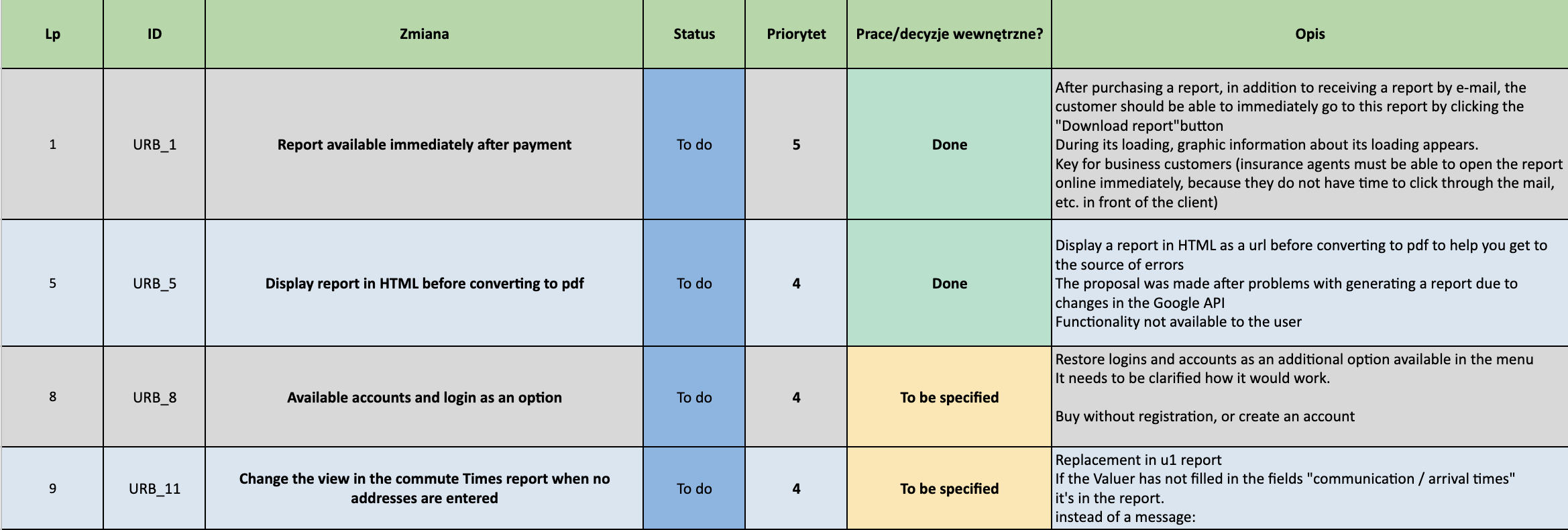
After the workshop, we usually have an approximate list of product screenshots, features, components, etc. We add all this information to the Backlog — Google Sheet document, and set priorities and estimates. In it, we also update the status of these components. The client also has access to this document.
3. Navigation Concept / Navigation Concept
Next, we develop templates/patterns for different types of screenshots, which we will take as a basis when developing a prototype. For example, a Profile page screen will have one pattern, a screen with a list of products will have another, and an Edit mode screen will have a third.

4. Wireframing / Prototype
The next step and one of the key ones are creating the prototype of a digital product.
There are two types of prototypes:
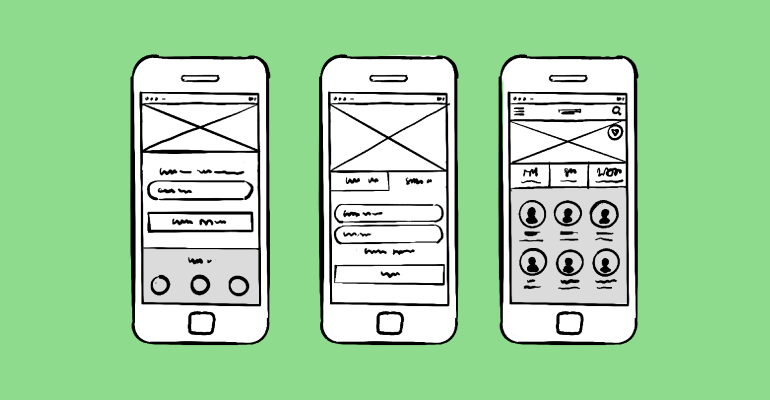
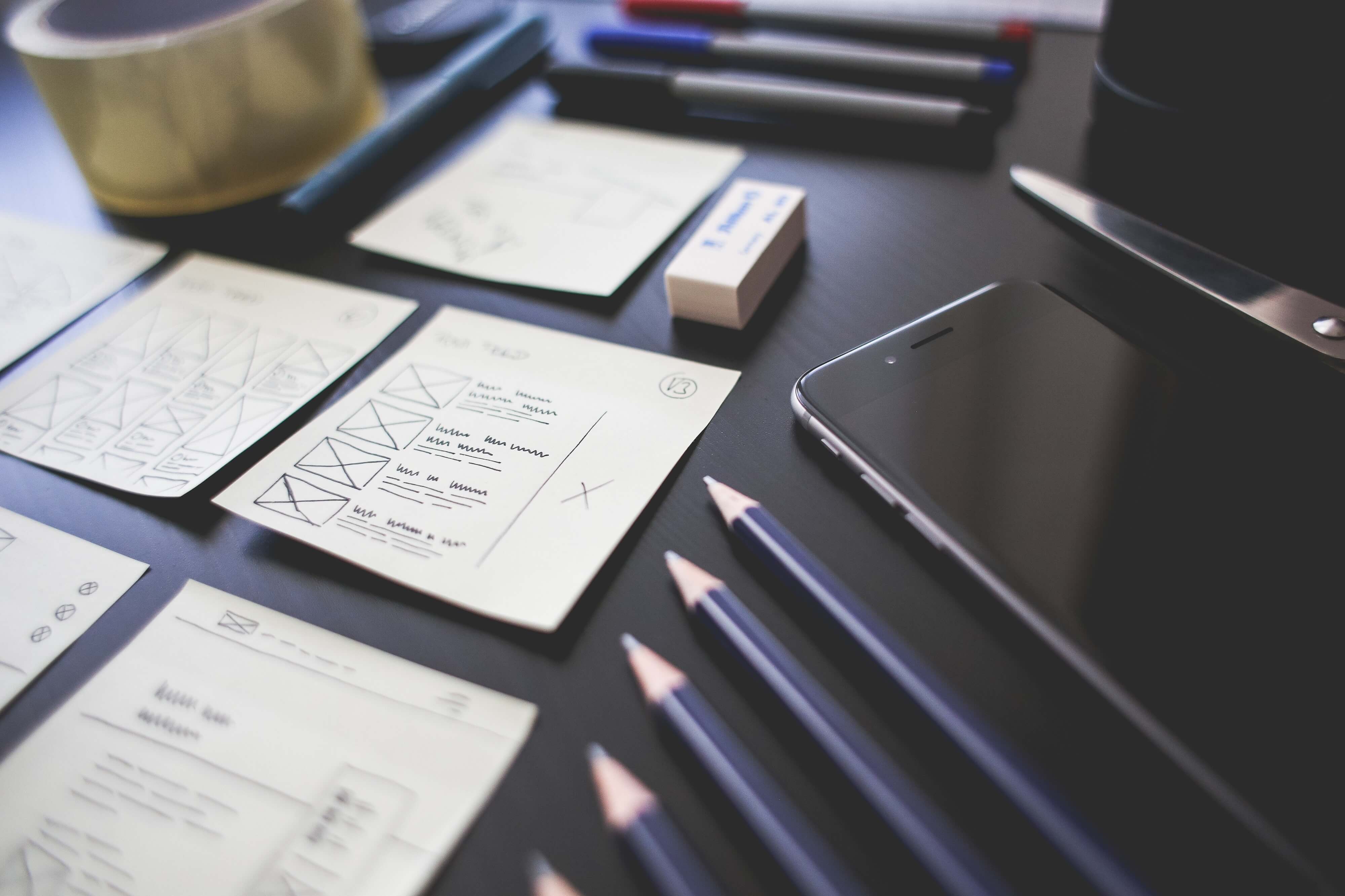
Low-fidelity prototypes are much faster to create and, as a rule, are a tool to facilitate teamwork on a project. These can be sketches on paper or on a whiteboard.
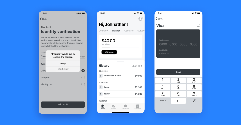
High-fidelity prototypes feature more relevant content, and specific font options, and may contain more accurate information about image sizes and even button styles. We play with shades of gray to show the subtleties that can only be seen by applying different shades of color and navigation styles. In most projects, we develop high-fidelity prototypes. This further accelerates the development of visual design.
5. Clickable prototype
Next, we use the well-known Figma application to create a clickable prototype. This makes it much easier to explain the interaction and navigation inside the product even before creating the user interface and layout. It is also a great way to communicate with the client. You can have an offline discussion, and get feedback using comments.
6. Visual Design
Before starting to develop the visual design, we show our client several types of mood boards. We get feedback on which direction they would like us to move in and then we start to work on visual design.
For the development of the interface, there are also several principles that we follow:
The user should easily navigate the interface. To do this, you should use concise elements, and place the components in easily accessible places.
Icons and illustrations in the application should be clear and not overloaded with images, and the text should be easy to read and legible.
We also use guidelines (instructions and requirements of manufacturers). They describe both UX and UI principles for different platforms – there is Google Material Design System for Android, and Apple Human Interface Guideline for iOS.
We always test apps on screens of different sizes. Just as we showed it to you on a screenshot in step 3. Optimizing the design for different devices will avoid buttons disappearing, truncation of elements that go beyond the edges of the screen, too small a font, and other problems of ill-conceived scaling.
The main thing in UI you have to always remember is that you are creating an app for people – and they should get the most out of it.
7. Interaction Animations
At this stage, we present the interaction animation between the elements. We show it not only to the client but also to developers when they sit to make up the product.
Animation in a mobile application pursues a clear, logical goal. It reduces the load on the user's brain, prevents the user from missing some important changes, and improves the efficiency of spatial relationships of interface elements. But there is one more thing. Animation makes the user interface alive.
The visual response is incredibly important in user interface design. In real life, buttons and other controls respond to our actions, this is what we expect from them. And interaction with the response encourages the user to master the application more deeply through the creation of logical reactions to user actions. After a user action (input event), the system should always provide immediate visual confirmation.
User interface elements like buttons and controls should seem tangible, even if they are covered with a layer of glass on top. To maintain a sense of reality, visual cues and motion signs recognize the input and instantly animate the action so that it appears to be a direct manipulation.
The user wants to control everything and believes that the application behaves as expected of him. You could even say that users don't like surprises. Real-time animation informs the status of the process in the application, helping the user to quickly figure out what is happening at the moment.
You should use animation to smoothly transfer users between navigation contexts, explain changes in the organization of elements on the screen, and strengthen the hierarchy of elements. Interactive design can effectively direct the user's attention, combining business with pleasure. You should create visual connections between transition states through colors and stable elements. The transition between the two visual states should be clear, smooth, and easy. Animation maintains a hierarchy of information, indicating which content is most important by creating a reference point for the user's vision. The most basic use of animation is in transitions, but the application can please the user when the animation is used outside of the standard actions. It can exist in all components of the application, at all scales, starting with detailed icons, and ending with key transitions and actions.
Animation for the sake of animation is an unsuccessful option (almost always). When an animation does not carry any functional load, it usually looks strange and very annoying. Also, remember about the duration - will the animation be annoying when playing for the 100th time, or will it still seem unobtrusive?
Animate with a specific purpose. Instead of animation purely for fun, you need to focus on the practical side of the question - how animation can be useful to the user.
Conclusion
Summing up, the whole UX process in our team takes 7 steps: starting with a workshop with our client which usually takes 2-3 days and includes a few other steps (Creating a Persona, Identification of the main functions of the product, and analysis of competitors and Card Sorting & Information Architecture). Then in the second step, we usually have an approximate list of product screenshots, features, and components, which we add to the Backlog — Google Sheet document, and set priorities and estimates. In the third step, we develop templates/patterns for different types of screenshots, which we will take as a basis when developing a prototype, which is the fourth step. After developing an ordinary prototype, we move to the fifth step, which is developing a clickable prototype on Figma. In the sixth (penultimate) step, we create a visual design - several types of mood boards and then show it to our client. And on the last - seventh step we present the interaction animation between the elements and show it to our clients and developers before they start developing a final digital product.
And in conclusion, I have said that there is no ideal UX process for all of the products. It varies from project to project, supplemented by something new. It is very important to analyze the process and approach to work after the completion of each project, to do work on mistakes. Create a design with care for the user. Attention to every detail is the key to your success in realizing the simplicity of human-computer interactions. Thoughtful design animations, moreover, allow them to communicate much more effectively. The easier your product is to use, the more likely it will be used. That’s what the process in Mobile Reality looks like and that’s how we make digital products for our clients and their users. Check out our end-to-end software development services page as we offer full-stack mobile & web product development, business intelligence services, data analytics, and machine learning. You don’t have to spend time on the whole UX & UI process as we’re here to help you with the development of your digital product.
We will also be glad if you share your experience in the comments. Also, check out our Mobile Reality Blog for new articles about design and mobile development.
Exploring UX, UI, and Graphic Design at Mobile Reality
Dive into the vibrant world of UX, UI, and graphic design with Mobile Reality. We're excited to share our extensive expertise and unique insights in these creative fields. Discover the challenges we face and the innovative solutions we craft in the realms of user experience, user interface, and graphic design through our carefully selected collection of articles:
Each article offers a deep dive into the nuances of UX, UI, and graphic design, enhancing your understanding of these crucial aspects of digital creation. If you're considering collaboration in UX/UI design or graphic projects, please reach out to our sales team for partnership opportunities. Additionally, if you're interested in joining our creative team, we invite you to get in touch with our recruitment department. We are always on the lookout for talented designers who are passionate about crafting exceptional user experiences. Let's connect and explore the potential of creative collaboration!
Did you like the article?Find out how we can help you.
Matt Sadowski
CEO of Mobile Reality

Related articles

19.04.2024
Top Blockchain Conferences That You Cannot Miss in 2024
Top blockchain conferences in 2024 around the world. Unique selection by the Mobile Reality team!
Read full article

19.04.2024
Mobile Reality at New York Fintech Week and Fintech Conf
Join Mobile Reality at New York Fintech Week, April 8-11, to explore fintech, proptech & blockchain innovations with industry leaders. #FintechNY
Read full article

19.04.2024
SaaS Architecture Guideline: Multi Tenant vs Multi Instance
Learn the differences between Multi-Tenant and Multi-Instance SaaS Architecture. Explore the benefits and drawbacks to make an informed decision.
Read full article